

Before picking new colors, it helps to step back and see how your rooms flow into each other. Stand in hallways and doorways and look at multiple spaces at once.
Ask yourself:
Which rooms are visible at the same time?
Where do the biggest clashes happen (for example, cool gray next to deep beige)?
Are there any colors you definitely want to keep or avoid?
Thinking in terms of sightlines and transitions—what you see from one point in the house—helps you plan paint that connects spaces instead of isolating them.
A whole-home color plan usually starts with one flexible neutral that works with your floors, trim, and furniture. This color becomes the “backbone” that ties everything together.
A good main neutral should:
Look good in different lighting conditions (bright rooms and darker hallways)
Coordinate with both warm and cool elements already in your home, if possible
Feel calm and timeless rather than trendy or extreme
You can use this main color in connecting spaces like hallways, entryways, and often in living or dining areas. Once that foundation is in place, every other color choice has something to relate to.
Accent colors are not the problem—random accents are. When each room has a completely different bold color, the house can feel chaotic. The key is choosing a small set of accent tones and repeating them intentionally.
You can:
Pick one or two accent colors that show up in your rugs, pillows, or art
Use those same accents in more than one room, even if in different amounts
Keep accent walls or bolder colors in key spots instead of every space
When accent colors echo each other from room to room, your eye reads them as part of one plan, even if each space still has its own personality.
You don’t have to paint every room the exact same color to create unity. Often, using lighter or darker versions of a similar tone is enough to connect spaces while still giving each room its own feel.
For example:
A soft neutral in hallways, a slightly deeper version in the living room, and a lighter version in a small office
The same color family used in different strengths—75%, 50%, or 25% tints
Warm whites, light greiges, and deeper taupes that all share the same undertone
This approach keeps the overall mood consistent while allowing for variation, so rooms feel related but not identical.
Even if wall colors change from room to room, consistent trim, door, and ceiling colors can calm the overall look of the house.
Simple ways to use these elements:
Paint trim and doors the same color throughout the home for a clean, unified frame
Keep ceilings in a light, consistent tone so they don’t compete with the walls
Use the same sheen (for example, eggshell on walls, semi-gloss on trim) for a smooth, professional feel
When these “supporting players” are consistent, you can adjust wall colors more freely without losing the sense of connection from space to space.
A mismatched home doesn’t always need new furniture or a full remodel—often, it just needs a smarter paint plan. By looking at the house as a whole, choosing a main neutral, repeating accent colors on purpose, and keeping trim and ceilings consistent, new interior paint can turn scattered rooms into a unified, comfortable home.
The goal is not to make every room look the same, but to help them feel like they belong together—so moving from one space to the next feels natural, calm, and intentional.
If your property needs multiple painting tasks handled the right way, stop juggling contractors.
📞 Call (828) 708-5573
📧 info@orpaintingllcnc.com
🌐 www.orpaintingllcnc.com
Schedule your free general painting estimate with OR Painting LLC and get one professional solution instead of many small problems.


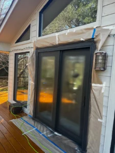
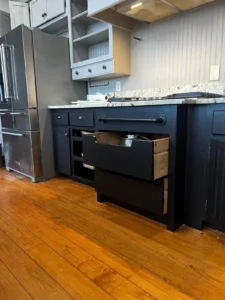

At OR Painting LLC, our experts help you select the perfect palette that enhances your home’s size, style, and personality—creating a balanced look that feels just right.